PICK LICENSE AND DOWNLOAD THE TITLE FONT →
Introduction: Designed for Maximum Impact
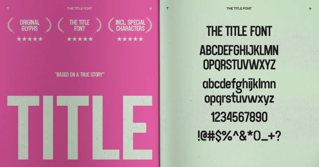
In the competitive landscape of visual design, your title isn’t just text; it’s a declaration. THE TITLE FONT is designed to make an impact, perfect for those bold, attention-grabbing titles. This font was created with a condensed character to maximize space while amplifying visual power, making it an ideal condensed font for titles.
It stands out in any design with its clean lines and modern aesthetic, combining uppercase impact with a unique lowercase style that adds personality. When you need your message to resonate instantly, THE TITLE FONT delivers.
FEATURES
- Uppercase + Lowercase
- Numerals, Punctuation, Symbols, Marks
- Latin Glyphs
- Formats: OTF, TTF, WOFF, WOFF2
- Best for: Logos, Headlines, Posters
- Introduction: Designed for Maximum Impact
- FEATURES
- TEST AND TYPE WITH THE TITLE FONT
- Characteristics: Authority Meets Distinctive Flair
- Usage & Application: Power and Clarity in Every Project
- Who It’s For: The Designer Who Demands Impact
- How to Use THE TITLE FONT Effectively: Unleash Its Full Potential
- Frequently Asked Questions about THE TITLE FONT
- DOWNLOADTHE TITLE FONT
- Final Thoughts: The Power of a Perfect Title
TEST AND TYPE WITH THE TITLE FONT


Characteristics: Authority Meets Distinctive Flair
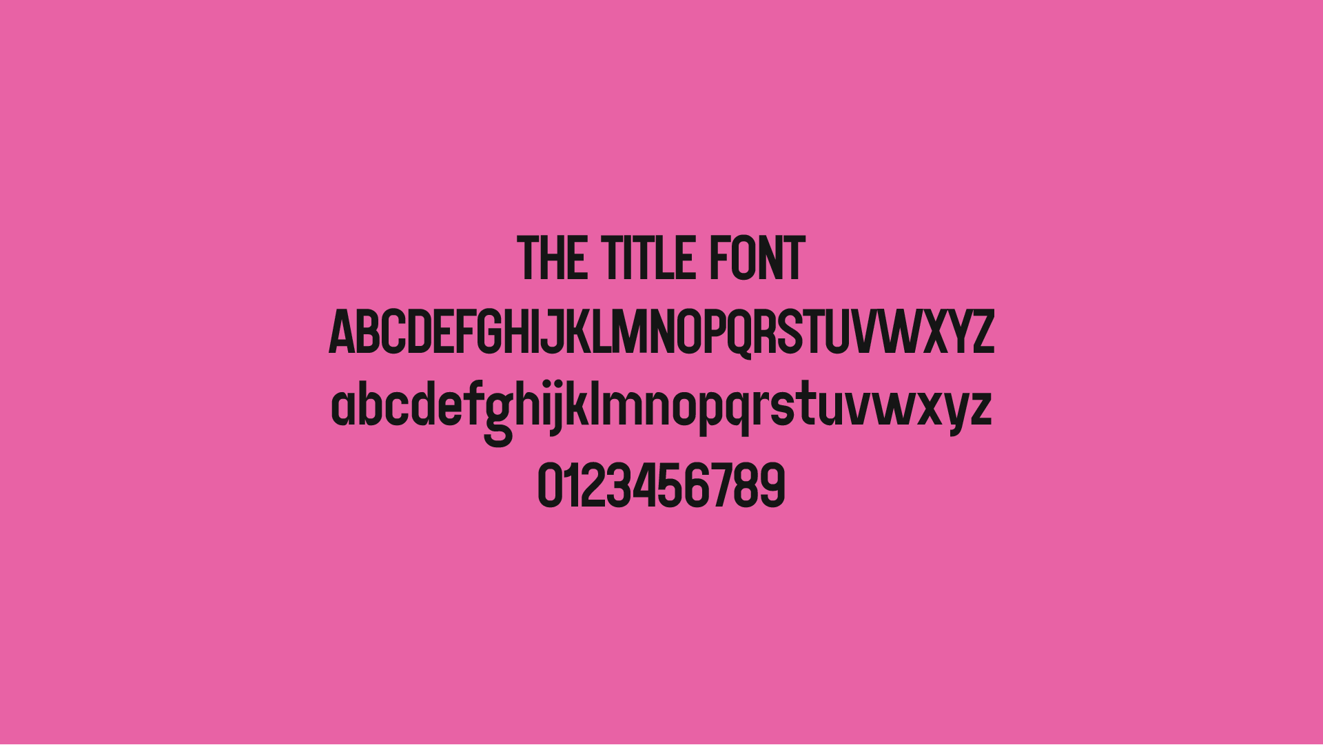
THE TITLE FONT is a condensed typeface, built for high readability and bold presence. The uppercase letters carry a sense of authority, commanding attention with their structured and impactful forms. Meanwhile, the lowercase characters introduce a distinct flair with subtle variances, adding personality without sacrificing clarity.
Its strong, structured appearance makes it ideal for conveying messages with confidence and clarity. It’s a truly versatile display font that balances robust design with unique touches, perfect for bold headlines and impactful statements.
Usage & Application: Power and Clarity in Every Project
THE TITLE FONT is your secret weapon for making text unmissable. It is ideal for titles, headlines, poster designs, cover pages, and marketing materials. This font adds an unmistakable sense of power to any project.
Whether used in large-scale designs like billboards or more compact layouts such as digital ads, it ensures your message stands out with bold clarity. It’s the ultimate font for headlines and a powerhouse for any project that needs to grab attention instantly.
Key Use Cases Include:
- Book and Magazine Titles: Making covers pop off the shelf.
- Film and Video Game Titles: Creating a memorable opening statement.
- Advertising Campaigns: Delivering punchy, unmissable taglines.
- Event Posters & Flyers: Ensuring crucial information is seen from afar.
- Brand Logos: Crafting a strong, confident brand identity.
- Album Art: Setting the tone with powerful typography.
- Website Headers: Instantly engaging visitors with clear, bold statements.
- Social Media Graphics: Designing impactful posts that stop the scroll.
- Product Packaging: Ensuring brand recognition on shelves.
Who It’s For: The Designer Who Demands Impact
THE TITLE FONT is designed for creative professionals and businesses who understand the critical role of strong typography in conveying a powerful message. It’s an indispensable asset for:
- Graphic designers specializing in branding, advertising, and editorial design.
- Marketing managers creating high-impact campaigns.
- Content creators needing arresting visuals for digital platforms.
- Filmmakers and video producers for title sequences and lower thirds.
- Publishers for book covers and magazine layouts.
- Anyone seeking a versatile, condensed font that excels in both large and small applications.
How to Use THE TITLE FONT Effectively: Unleash Its Full Potential
To maximize the impact of THE TITLE FONT in your designs, consider these expert tips:
- Lead with It: Primarily use it for main titles, headlines, and key phrases. Its robust nature is meant to be at the forefront.
- Strategic Pairing: Given its strong presence, pair THE TITLE FONT with a more neutral, highly readable sans-serif or serif for body copy to create visual harmony and ensure legibility for longer texts.
- Mindful Spacing: Despite being condensed, pay attention to letter-spacing (kerning) to ensure optimal visual balance and readability, especially at very large sizes.
- Color Play: Experiment with vibrant colors or strong contrasts to make it pop. It works exceptionally well against dark backgrounds or with striking gradients.
- Minimalist Backgrounds: Allow the font to command attention by keeping backgrounds clean and uncluttered. This emphasizes its inherent boldness.
- Scale Wisely: While it’s designed for impact at large sizes, test it at smaller scale for things like subheadings or brief callouts to see how its personality translates.
Frequently Asked Questions about THE TITLE FONT
To help you get the most out of THE TITLE FONT, here are answers to some common questions:
- What is THE TITLE FONT best for? THE TITLE FONT is best for bold, attention-grabbing titles, headlines, poster designs, cover pages, and marketing materials.
- Is THE TITLE FONT condensed? Yes, it is a condensed typeface, created to maximize space while amplifying visual power.
- Does it have unique lowercase characters? Yes, the lowercase characters introduce a distinct flair with slight variances, adding personality.
- Does THE TITLE FONT ensure clarity? Yes, its strong, structured appearance ensures high readability and bold presence, conveying messages with confidence and clarity.
Can it be used in large-scale designs? Absolutely! It thrives in large-scale designs and ensures your message stands out with bold clarity.
GRAB FULL ATTENTION AND LEAVE AN IMPACT
DOWNLOAD
THE TITLE FONT
Final Thoughts: The Power of a Perfect Title
In the visual narrative, a strong title is often the first and most crucial interaction. THE TITLE FONT is meticulously designed to ensure that interaction is impactful, memorable, and clear. It’s more than just a font; it’s a strategic choice for designers who understand that the words themselves can be a powerful design element.Choose THE TITLE FONT to ensure your message doesn’t just get read, but truly resonates, demanding attention with confidence and unparalleled visual strength.