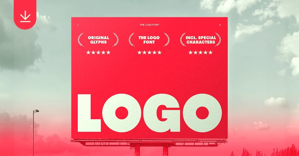
PICK LICENSE AND DOWNLOAD THE LOGO FONT →
Introduction: Channeling the Spirit of Bold Typography
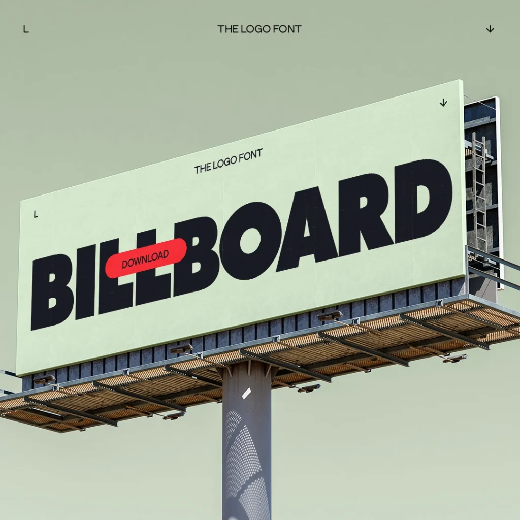
THE LOGO FONT is a bold uppercase display typeface designed for logos, headlines and branding. Typography is often the difference between someone stopping — or scrolling. Some projects demand a font that doesn’t ask for attention — it takes it. That’s exactly why THE LOGO FONT exists.
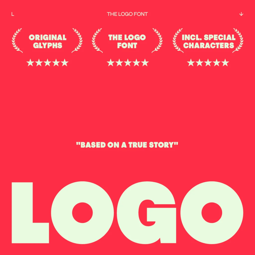
Designed during a real logo assignment that needed unapologetic confidence, this font was born out of necessity — the kind of necessity that forces you to build your own tool instead of settling for what already exists.
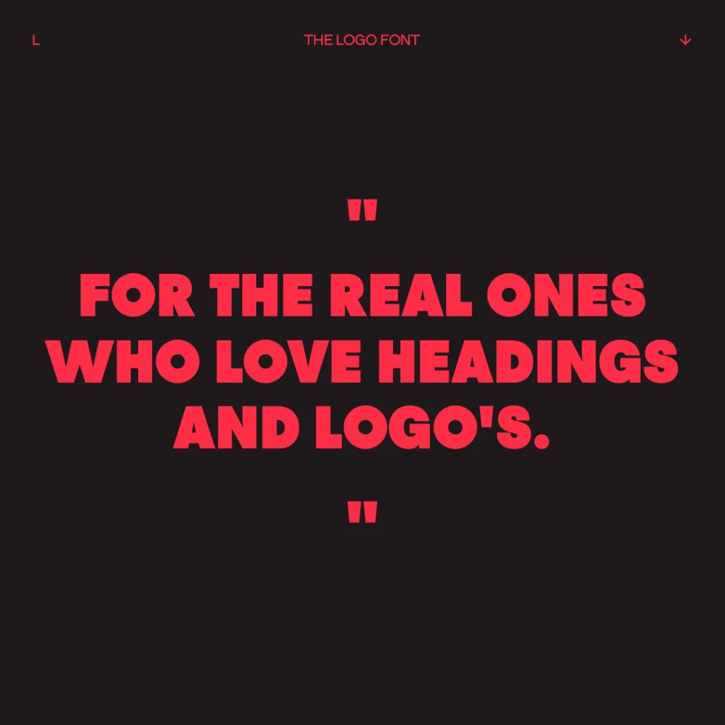
Inspired by two iconic pillars of typography and merged into a new beast, THE LOGO FONT isn’t interested in subtlety. It’s a big bold display font, built for designers who want their work to be seen, not whispered. Perfect for: Logos & Branding • Posters & Banners • Web & Digital Design • Headlines & Titles • Packaging • Social Media
FEATURES
- Uppercase + Lowercase
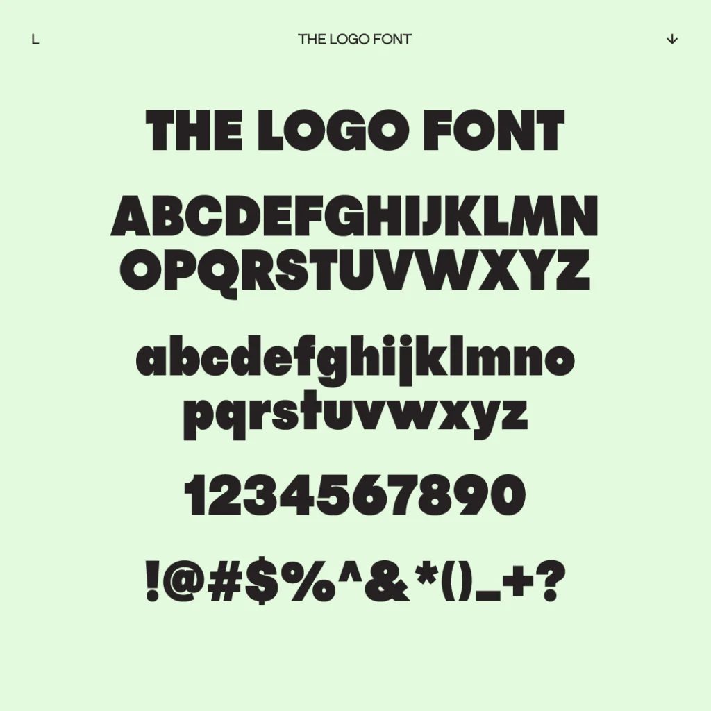
- Numerals, Punctuation, Symbols, Marks
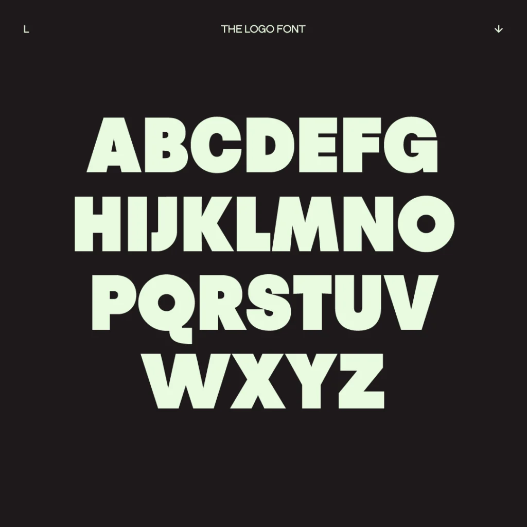
- Latin Glyphs
- Formats: OTF, TTF, WOFF, WOFF2
- Best for: Logos, Headlines, Posters
- Introduction: Channeling the Spirit of Bold Typography
- FEATURES
- TEST AND TYPE WITH THE LOGO FONT
- Characteristics: A Bold Display Typeface with Serious Weight
- Usage & Audience: Made for Designers Who Build Loud Work
- How to Use THE LOGO FONT Effectively: Practical Designer Tips
- Frequently Asked Questions about THE LOGO FONT
- Download THE LOGO FONT
- DOWNLOADTHE LOGO FONT
- More Fonts You Might Like
- Final Thoughts: Not subtle, Not safe, Not shy
TEST AND TYPE WITH THE LOGO FONT
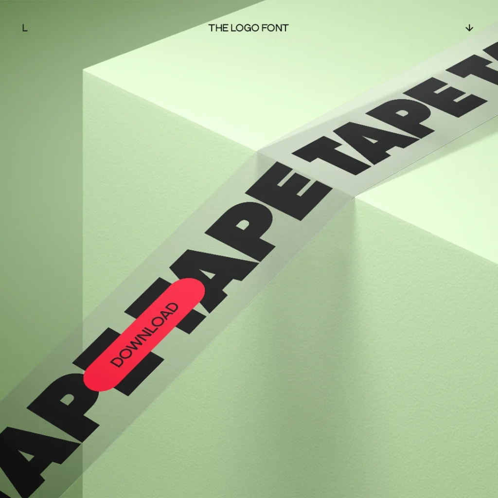
Characteristics: A Bold Display Typeface with Serious Weight
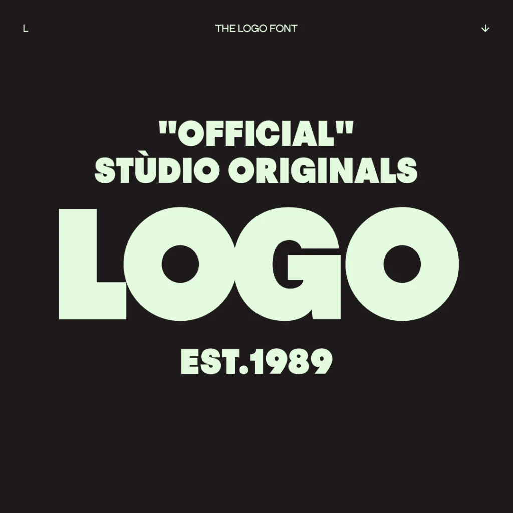
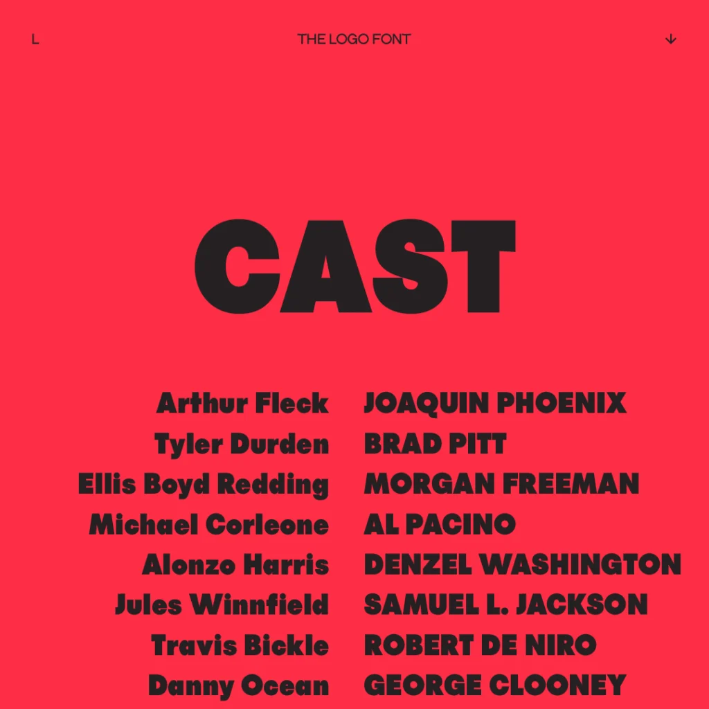
THE LOGO FONT was built to dominate space without apology. Its forms are thick, anchored, and engineered to perform at scale—from the side of a building to the first frame of a motion intro. It holds the eye the way a stadium title does: not by decoration, but by raw mass.
Despite its weight, the font is carefully balanced. Curves are controlled, edges are intentional, and spacing is tightened just enough to give every letter the “logo-ready” feel that most bold fonts fail to deliver. This is not a headline font pretending to be a logo font — it was designed like a logo from the start.
Key Traits
- Uppercase-based display font
- Optimized for large-format typography
- Includes numbers, punctuation, symbols, and special glyphs
- Built for both print and digital (OTF, TTF, WOFF)

Usage & Audience: Made for Designers Who Build Loud Work
THE LOGO FONT is not a passive typeface — it was built for projects that demand attention on purpose. If you design identities, campaigns, or digital experiences where typography is the hero, this is the kind of font you reach for when “bold” needs to mean something. It behaves consistently across branding, posters, packaging, websites, and social — delivering the same heavy, confident presence in every medium.
This font is especially suited for creatives and teams who don’t work in whispers: brand designers who build identities with weight, poster designers who need visual impact from across the street, and digital creators who know that strong typography is a strategic business tool, not just decoration.
Perfect for:
- Logos & branding systems
- Posters, campaigns, and event graphics
- Website headers & landing pages
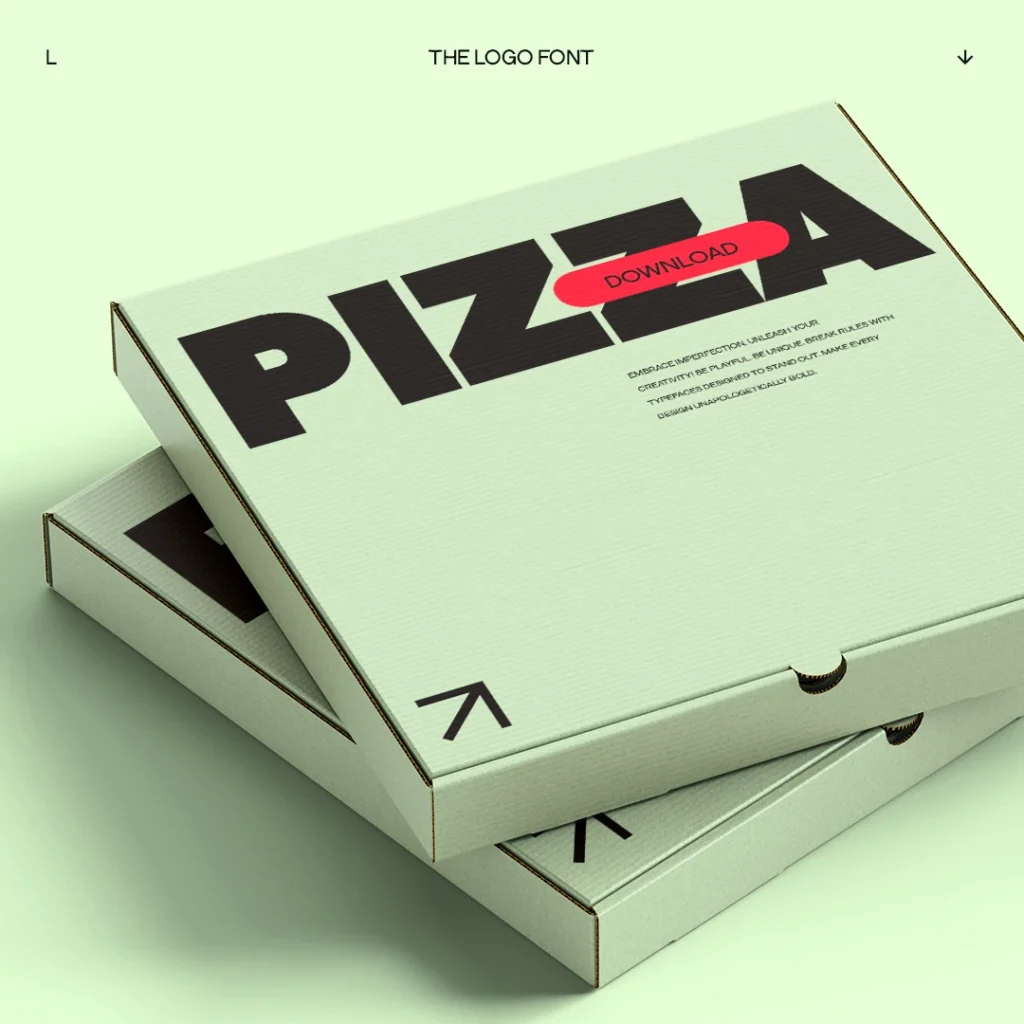
- Merch, packaging & physical brand assets
- Film titles, trailers & OOH advertising
- Social media announcements and hero slides
How to Use THE LOGO FONT Effectively: Practical Designer Tips
A bold font doesn’t guarantee bold design — it’s all in the treatment. THE LOGO FONT responds best to restraint: big type, minimal companions, and confident use of space. Capital letters work especially well when stretched across a grid or used in dense, compact lockups.
It also pairs beautifully with neutral grotesk body fonts or super-light serif contrasts, making it versatile inside identity systems. Soft color palettes with a bold type anchor can create a beautiful designer tension — or go all-in with high contrast for maximum aggression.
Practical ways to use it well
- Use full uppercase for brand marks and headlines
- Pair with clean sans-serifs for body or subtext
- Try both wide-tracking and ultra-tight spacing depending on tone
- Works best with high-impact colors (black, white, red, neon)
- Great in both solo-word lockups and stacked poster layouts
Frequently Asked Questions about THE LOGO FONT
Is THE LOGO FONT actually good for logos?
Yes, it was literally designed when doing a logo project. It’s bold attitude is ideal for logos, branding, and bold wordmarks
What license do I need for commercial use?
To pick the right license please scroll to the license section. And choose your businesses size.
Can I use it for web embedding (webfont)?
Yes, we provide multiple formats including WOFF and WOFF2
Does THE LOGO FONT include special characters?
Absolutely, it includes punctuation, symbols, numbers, and special glyphs.
Is THE LOGO FONT a good font for posters and movie titles?
Yes, it works exceptionally well as a bold poster font and headline font.
Download THE LOGO FONT
Upgrade your typography toolbox with a display font built for impact and identity. Download THE LOGO FONT and create designs that speak with authority.
All licenses include OTF, TTF, and WOFF formats
License Options:
SMALL
INDIVIDUAL
Made for individual creators and freelancers, this license is perfect for personal projects, independent designers and solo entrepreneurs.
MEDIUM
2 – 12 BUSINESS
Tailored for small to medium-sized businesses with 2-12 employees, providing an affordable and flexible option for growing teams.
LARGE
12+ COMPANY
This is for established companies with 12 or more employees, ensuring businesses with broader reach are properly licensed.
GRAB FULL ATTENTION AND LEAVE AN IMPACT
DOWNLOAD
THE LOGO FONT
More Fonts You Might Like
If you love this font and impactful typefaces, explore these other hits from THE BOLD FONT – TYPE FOUNDRY:


Final Thoughts: Not subtle, Not safe, Not shy
THE LOGO FONT is not subtle, not safe, not shy — it’s for designers who build brands that enter the room first. When minimalism still needs power, this is the font you reach for.
Go big. Go bold. Use THE LOGO FONT.